You may have noticed I’ve updated my logo! I’ll share another post with more updates soon, but today I thought it would be fun to share the evolution of my logo, branding and website design.
I love watching designers and small business owners grow and change as their interests and skills develop. For those of you that haven’t been following along since 2013, I’m sharing the early work. It’s pretty rough, but wasn’t everybody back then?
We didn’t have to be graphic designers, web developers, and experts at everything! At least my photos were decent…
(Some links below are affiliate links, which means I make a small commission at no cost to you! Thank you!)
The Developing Logo:
Ready? Check out these logos!
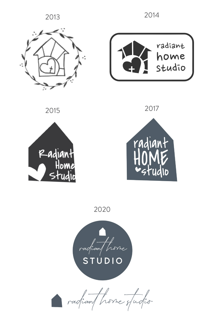
Somewhere around 2016, I learned a lot about branding, typefaces, color, and balance. You can see the trend toward simplicity. Knowing when to cut details and keep things simple is one of the greatest design lessons I’ve learned in 7 years.
The 2013 logo was just a sketch that I traced with a free vector graphics program. I quickly realized I needed something more graphic and streamlined (and with words!), but I’m not sure what I was thinking with the font. I think I was looking for a handwriting font, but Creative Market was still in its early days and I was too cheap to buy anything. And obviously, there’s still way too much going on!
Making progress in the 2015 logo, but it’s still lacking good balance with spacing and with the font. I hadn’t quite figured out that black didn’t fit into my color palette even though everyone else was doing stark black and white. (Thanks to Fiona Humberstone and Style Your Brand for help understanding brand color psychology!)
I managed to use the same font in the next version, with much more balance. And found my color palette. I don’t dislike my 2017 logo, but I needed something that worked better in a linear form and felt more sophisticated.
The 2020 version has some variations that work for all my web and print applications. It feels more refined, and it sets the tone for my growing body of surface pattern designs.

The Developing Website Design:
Ready for the website design?
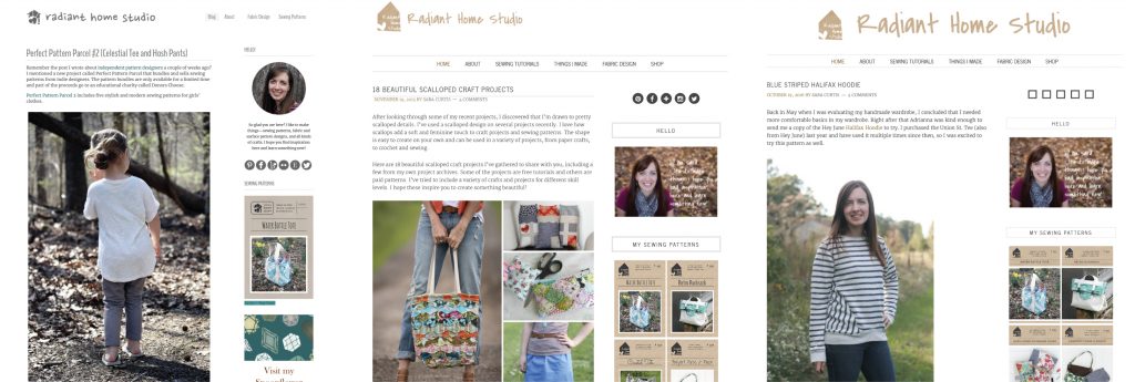
These are the early website designs. I used a basic free template for several years until I could afford a paid theme. The layout isn’t terrible. I can see where I learned CSS between the second and third images. The lines are thinner, the logo fits better, and some of the other small details are changed.
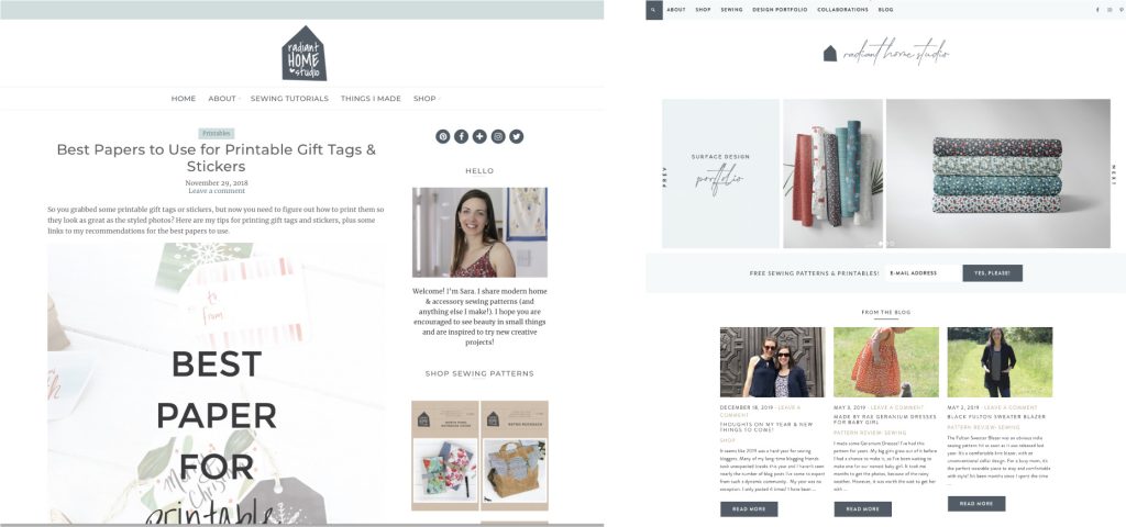
And then I bought a paid theme! Such a difference. By 2016, I was customizing my own website and occasionally hiring a pro to help with big issues. A few months ago, I decided to integrate my surface design portfolio into the website and changed from a standard blog setup to a website landing page.
The first paid theme was recommended by a developer, but I hated it. The back end was so confusing, with so many unnecessary features. It looked fine, but it wasn’t user-friendly. I switched to a Restored316 theme, and I LOVE it. There are tons of tutorials on their website and the FB group is also a wonderful resource. If you want to check out their other themes, click the image below.

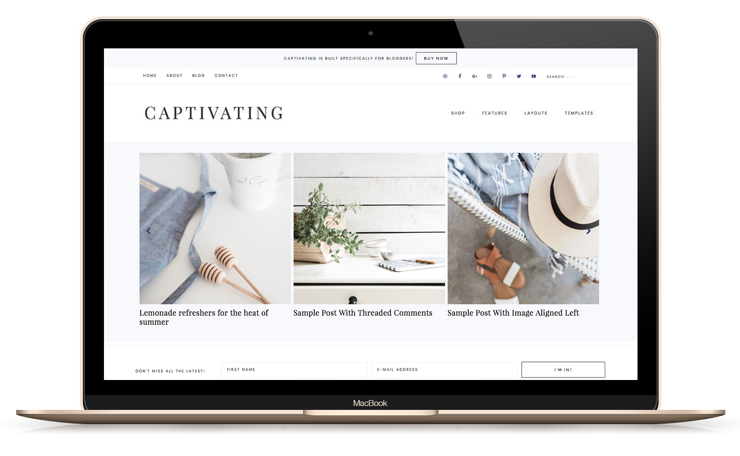
I’m still adjusting details as I go, so I assure you that this is not the “final” version. But slow, incremental changes are the best way to grow!
So, there you have it. A history of all my bad developing logo designs and website updates. Start where you are and take time to grow slowly! 😊


I love your new logo! Reading about your development is wonderful. I am a graphic designer turning into surface pattern designer and am at the beginning stages of reworking my logo and website too. Thanks so much for sharing your progress!! Is Restored 316 a site to build websites like Wix, etc?
Thank you! My website is built on WordPress and Restored316 sells WordPress based themes. It’s a little less user-friendly to set up without a developer, but Restored316 offers setup at a pretty reasonable price if you aren’t up for trying it yourself! 🙂
I love it! I need to redesign my logo, I just haven’t been able to settle on something I love…but maybe I’ll get there soon. Love yours!
I’m happy to brainstorm with you, friend! Email me anytime!